
Contents

In this note I will show my attempt to replace the original steam engine of this beautiful poster with an equally old electrical locomotive. Days of work! It did result in something impossible! Plus a revelation.
Started 15May2020, updated31May2023 (Ref [4]. Another example of focus stacking. New download of large file) – finished
This note is in group My Crocodile locomotive pages, MODELS, MINIATURES and ALL TRAINS TO STOP
The original poster

Fig.0 – Poster, SR, ‘I’m Taking and Early Holiday cos I know Summer Comes Soonest in the South’. (See [2] and below)
I love the boy chatting away with the locomotive’s fireman. The fireman has time to listen to the boy who tells that he’s taking an early holiday cos he knows summer comes soonest in the south.
At my age I ‘m not certain where I see myself in these two. In both.
But steam locomotive? Even if I know that absolutely nothing beats the original poster, why not have some fun with it?
What started this was the very cold 2020 mid-May period in the part of Norway where I live – when some of us wanted to go south in Norway. Corona times forbid further than that. But going shorter, what about just trying to replace that steaming King Arthur locomotive with my lovely Märklin 55681 1/32 scale 1 model of the Swiss Ce 6/8 III electric «crocodile»?
I can then go to the year 1936, to the Waterloo railway station in London and to Olten in Switzerland while still just messing around right here.
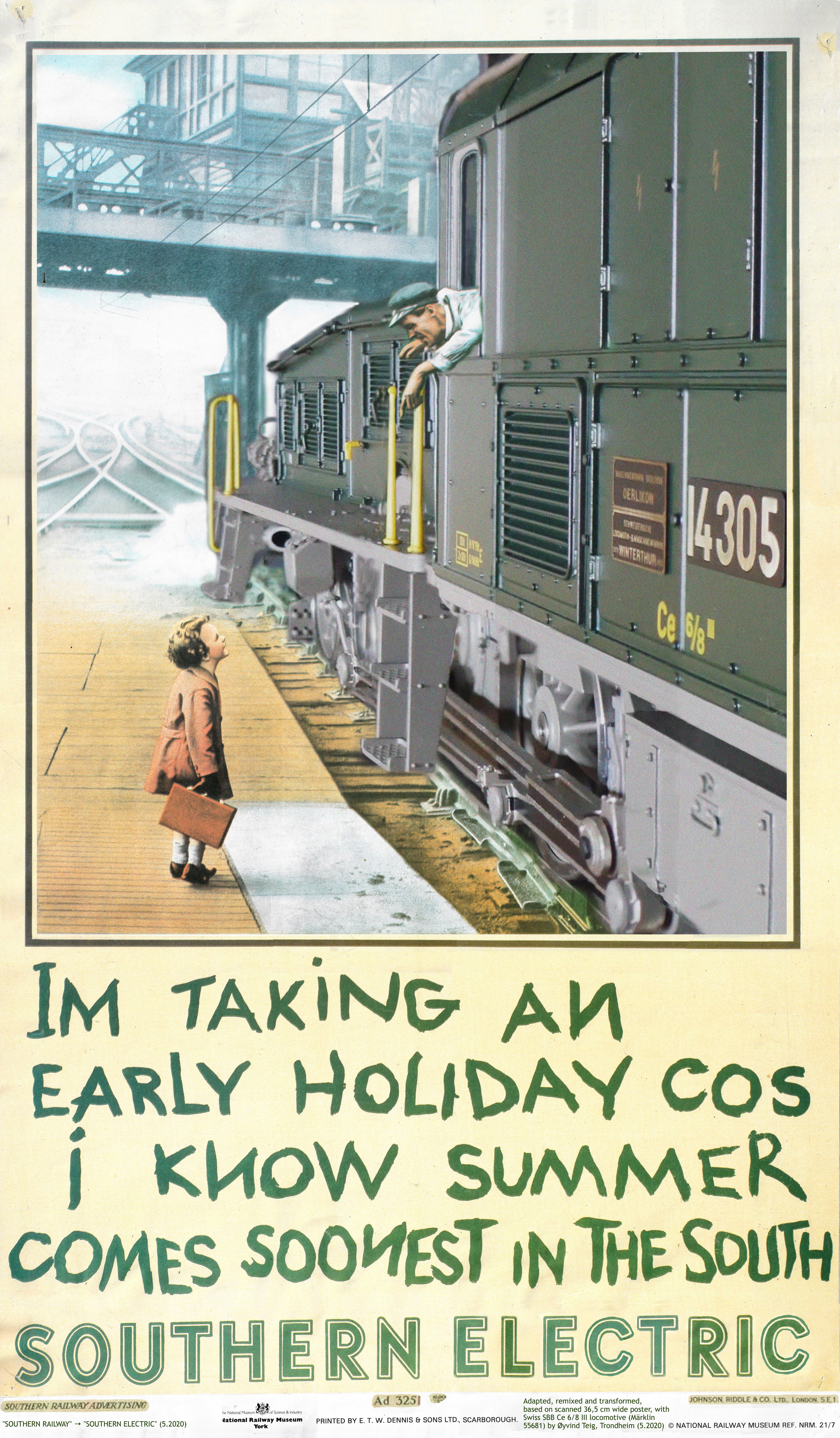
«My poster»
Fig.1 – Poster as adapted, remixed and transformed, based on a scanned 36,5 cm wide poster («Im taking an early holiday cos i know summer comes soonest in the south» by Charles E Brown and Johnson, Riddle and Company Limited for Southern Railway, 1936), with Swiss SBB Ce 6/8 III locomotive (Märklin 55681) by Øyvind Teig, Trondheim (5.2020) («SOUTHERN RAILWAY» → «SOUTHERN ELECTRIC» (5.2020)
My main goal with this variant was to see if it were possible that the excitement in the little boy’s body language when talking with the driver, would be lost when I replaced the poignant steam engine with a different, but also dramatic, electric locomotive.
The poster’s theme first appeared in a 1925 sepia toned poster. However, the coloured 1936 version is more dream-like. The data says it’s a photograph. On the 1936 version the track is lost in the fog, not in the woods. The artist Charles E. Brown (not Peanut’s figure Charlie Brown) must have worked a lot on it to give it even more magic. He did not have Photoshop, but he did have retouching pencils, typographic techniques and the lot. They were not as helpless as we tend to think, 85 years ago. And the artistic mind was no less impressing. Plus, humour has always been with us. In my head it ended up as a beautiful painting. Update: Bogenschütze says (below) that «The poster was a colourised version of a black and white photo taken in 1924.»
The driver is also quite proud of himself. He used to be a little boy, and he used to be charmed by these steam engines. He knows what it is like to stand there. He knows that the boy doesn’t have much in his suitcase, perhaps only a pair of socks. The boy is so happy that one foot almost doesn’t touch the ground, he just can’t wait. Maybe his father shot the original picture, back in 1924.
At about the same year (1925) the electric locomotive Ce 6/8 III road number 14305 was manufactured in Switzerland. This is one of the three remaining «crocodiles», and 14305 has home town in Olten. It has fascinating rods to push the wheels around, just like on the steam engines. It does not matter whether the boy and man are English or Swiss. Or Norwegian, a lifetime later.
In many ways I still have a light suitcase. I am still proud to be alive and sit up here, ready to bring the train safely to the destination. Carrying a boy with eyes wide open. Then, ready for the return haul. So even if all trains are to stop, that’s not now.
About the original poster
Records at Science Museum Group
The original poster, as shown in the first chapter – (or I assume, one of the original posters?) – now resides at Science Museum Group [2], where I read that:
| Science Museum files | |
| TITLE | «I’m Taking an Early Holiday Cos I Know Summer Comes Soonest in the South» |
| MADE | 1936 |
| MAKER | Charles E Brown and Johnson, Riddle and Company Limited |
| PUBLISHER | Southern Railway (also used Southern Electric for marketing when that was in scope) |
| WHERE | Science Museum Group Collection |
| CATEGORY | Railway Posters, Notices & Handbills |
| OBJECT NUMBER | 1975-8404 |
| TYPE | Poster |
| TAXONOMY | Commercial records and equipment |
| COPYRIGHT | © The Board of Trustees of the Science Museum |
| ABOUT | Poster, Southern Railway, ‘I’m Taking an Early Holiday cos I know Summer Comes Soonest in the South’, 1936. Photograph showing a small boy carrying a suitcase on the platform at Waterloo station talking to the fireman of N15 King Arthur class 4-6-0 locomotive No 755 ‘The Red Knight’, as he leans from the cab. Text beneath. Text on the bottom margin of this poster reads «Southern Railway Advertising. Ad 3251. 10,000/1936. Johnson, Riddle & Co. Ltd., London, SE1». Format, double royal, (h x w) 40 x 25 ins, 1035 x 650 mm (*), backed. The original version of this poster was published in 1925, with the text «For holidays I always go Southern ‘cos it’s the Sunshine Line» [4] (*) Converting 40 x 25 ins correctly would be times 2.54 and would yield (h x w) 1016 x 635 mm. I assume it’s the 1035 x 650 mm that’s correct. I don’t know what «backed» means. My York poster is smaller: (w x h) 36.5 cm x 61.9 cm. The ratios are not equal. I assume there must be something with the «backed» or bottom margin that introduce this discrepancy |
| LICENCE | This image is released under a Creative Commons Attribution-NonCommercial-ShareAlike 4.0 Licence [3]. I may then: Share — copy and redistribute the material in any medium or format. Adapt — remix, transform, and build upon the material. Under the following terms: Attribution — You must give appropriate credit, provide a link to the license, and indicate if changes were made. You may do so in any reasonable manner, but not in any way that suggests the licensor endorses you or your use. NonCommercial — You may not use the material for commercial purposes. ShareAlike — If you remix, transform, or build upon the material, you must distribute your contributions under the same license as the original. |
| Not on Science Museum files | |
| NAMES | Boy: Ronald Witt. Crewman: fireman Woof (See «source 1» below) |
Book sources
The Railway Posters 1923-1947 book by Beverley Cole and Richard Durack [9] (1992) has some additional information (text copied from Google Books):
| These posters were among many reproduced from a snapshot taken in 1924 by commercial photographer Charles E. Brown at the end of one of the platforms at Waterloo Station. The original photograph was reprinted numerous times in several different guises. It showed a small boy with spectacles and suitcase speaking to the driver. The snapshot was sent in to the Publicity Department at Waterloo who arranged for the printers to enlarge it and make a photographic print. It was claimed that the resulting poster had a lifelike quality not previously achieved. Three thousand copies were printed. When the poster was issued the Southern Railway offered to present a framed copy, with a framed photograph of a «King Arthur» class | locomotive, to the boy shown, whose identity was then unknown. Quite a number of parents took their children to the offices at Waterloo but all were sent away disappointed. Eventually the little boy was found to have emigrated to California with his father who was formerly employed in the Electrical Department at Waterloo. The boy was called Ronald Witt.
Other versions of the poster included one issued to advertise the Penny-a-Week Red Cross Fund, as well as French and German language editions. The most recent was produced by British Railways and featured the little boy, complete with teddy bear, standing by an Intercity 125 train. Printed by Johnson, Riddle & Co Ltd. London SE1 |
However, Ronald doesn’t wear any glasses, does he? There also is an Italian version of the poster in [9].

1978 BR (press for source)
I found a 1978 Intercity 125 («Inter-City 125») poster here. It’s 102 x 63 cm. and made by St Michael’s Press for Britsh Rail.
Mister Im going on Holiday on your Train cos I know its The QuickeST.
Have a good trip!
However, the boy carries no teddy bear, at least not on this version. Which version could that be?
Private sources
Source 1
This is the revelation I mentioned in the intro.
 Quoting Bogenschütze at marklin-users.net forum: «I’ve been a fan of the Southern Railway and its constituent companies for almost 60 years and I have some notes about this poster that I made in the ’70s. Unfortunately I didn’t record the source. The poster was a colourised version of a black and white photo taken in
 1925 1924. The photographer recorded the name of the boy as Ronald Witt and the crewman as Fireman Woof from Nine Elms shed. I guess the SR PR department who produced the poster were way ahead of their time with the concept of «gender neutral«.» (here and below)
Keith Bowman (alias Bogenschütze) tells in a private mail that «the information was probably from an article in a British monthly magazine. At that time (early 1970’s), I regularly bought: Railway World, Model Railway News, Model Railway Constructor and Railway Modeller.» He also mentions that the N15 locomotive was an «ex London and South Western Railway loco«. Thanks!
Boy or.. girl?
This comment predated the above chapter. Probably, without this pondering about the sex of the person on the platform, the above facts might not have surfaced.
 Quoting DaleSchultz at marklin-users.net forum: «When I read your description, and the original description, I was surprised to see the child described as a boy. I find it very unlikely that a small boy would have had hair that long in the 1920s and 1930s. The white stocking also seem to suggest a girl in that era too… Anyone else think the artist was depicting a girl?» (here and below).
Great comment! That never appeared to me! But wouldn’t a girl have had a buckle or a hair bow? But if the little charm is boy or.. girl, the better for the poster, I assume? (As Bogenschütze says previous chapter, the poster is «gender neutral».)
My youngest daughter now said, when I asked her, that she always looked at the person as a girl, but never felt she needed to protest when I had talked about “him”. She now specialises in costume as a profession and says she thinks that maybe both views are fine. The poster is quite modern, in other words! But again, that world was more modern than we tend to think now.
My brother in law said the he believed that boys were traditionally often dressed as girls to avoid the biblical Massacre of the Innocents in the New Testament.
Aside: my father

Hans-Jacob Teig (1917)
This is my father (Hans-Jacob Teig, at Rjukan, carrying a wooden horse), although it’s from twenty years before. However, it predates the original poster by only nine years. To me he looks like a girl, yes. But his sisters are beside him, and they are dressed up in dresses proper, so there is no doubt. He’s the boy there. (More about him and the city development at Rjukan at 203:[A private aside].)
About «my poster»
It’s not really «my poster». But I couldn’t find any other name for it.
My starting point was the paper poster from York. I scanned it at 600 dpi in many parts (I only have an A4 scanner) and then merged the scannings into one. I wanted to get the dimensions right with no lens distortion, that’s why I just didn’t shoot a photo of it. And I got more pixels this way. The colours seem lighter than on the original above, so it may have been faded somewhat over the years, even in the entrance.

Fig.2 – Panasonic Lumix DMC-TZ100 and Märklin 55681 locomotive Ce 6/8 III photography with perspective lines
I then drew the perspective lines of the locomotive on the original poster and made two transparent foils with those lines present, one for the mobile and one for my camera. I could then hold the cameras at the correct position and take the picture. Finding that position was not as straightforward as I thought. It was not enough to have the highest blender of f8, where the lens is more like a flat glass with much depth, than a magnifying glass like f2.8 with distinct focus. But f8 was no enough, still only parts of the locomotive was in focus. The motive was just too deep compared with the lens.
Therefore I ended up with using the proper Lumix camera and its Post Focus function, where it would shoot 30 individual pictures with local focus. All of the same pixel size, but where focus then was found at different places for each picture of the movie that’s made.
I then merged those pictures into one by cropping away the unclear parts and keeping those in focus. Each picture was taken from a movie viewer by stopping it at concrete places.
Aside 21Jun2020: In [10] (in Norwegian) I learned that the term here is focus stacking. And that tools would certainly help with this. They mention Helicon Focus, but searching for this I found several photo editors supporting focus stacking. (5Aug2020:) I tested Helicon Focus, however, on a completely different picture. It certainly does the job. A lot of parameters may be set. The best thing for me, I guess, would be that it imports data from the TZ100’s MP4 file produced by Post Focus. It contained 45 JPGs. However, Helicon Focus comes at a price – but I may test the full version for a month. I’ll be back.
Update 08Feb2023: There is another example of focus stacking at 229:[Focus stacking] – and about the limitations of the TZ100 «Post Focus» recording mode.
I then saw that the nose of the locomotive was too small and just disappeared in the horizon. I therefore stretched it out a little by widening the the left part segments somewhat, non linearly. (Doing this in the bitmap editor by using the lens error fixing tool did not give a good enough effect. It looked too strange.) The distortion introduced by what I ended up with may also look somewhat strange to those who knows the anatomy of the locomotive from every angle. But I lost so much dramatic effect without it. I also tried to photograph with the loco in a left curve, both to make the nose and the rods more visible, but then the nose landed on the platform end.
I saw that in the original the steam loco is nicely tilted a little, to fulfil the perspective, so I did the same.
I also added some dotted noise to the new loco, to have its texture become similar to the original poster.
I then cloned the loco onto the original poster, by first having made a large bitmap from a page layout document with equally scaled parts. One part of the original to clone onto, one of the new loco and then another one with parts that I would need to repaint over pixels that had been messed from the new loco.
During the clone process I had to invent more of the motif’s bridge, and the air below the bridge. I did that by reusing some of the structures that were already there. I kept the steam in the front, partly because it has a nice dramatic effect, and I did not want to invent the track there.
I could not clone all pixels from the new loco with a single two-dimensional linear transform. I had to cheat with the one wheel, to make it look more realistic as being sitting onto the rail. I also had to make the front ladder smaller so that it would not look like it would have collided with the platform. This was an effect coming from my stretching of the front of the locomotive.
I filled the closed window with a black palette to make it look opened (I assume the glass is pushed down into the door), so that the driver could lean out of it. I had to position the window exactly in the same position as on the original, if not the boy and the man would not have had eye contact.
I then took the finished bitmap and inserted it into my page layout mode editor again and added the catenary wires. For this I used lines of hand-drawn types and made them more and more translucent.

1925 poster by SR NO. 1 – Electrification! by T.D. Kerr
As a separate work thread I had discovered that Southern Railway also had posters with electric trains (not the one to the left), and that they then called themselves «⚡Southern Electric» with a spark across [5]. I then picked out a C letter from that poster and transformed it to the right colours, and reused the other letters, all by cloning pixels in a graphical editor. I did not think I needed to keep the long spark, so I dropped it. I then had that lower part of the poster afresh, and added it in the page layout editor.
The poster to the left is from [9], (page 64: 1925 poster by Southern Railway «NO. 1 – Electrification!» by T.D. Kerr, printed by Waterlow & Sons Ltd. London, Dunstable & Watford) and I scanned it from the 1992 book, in hope of being forgiven by the National Railway Musem at York (It’s already at Pinterest, of course..) The reason I present it here is that I think it rather interesting to see all the electric trains, and no pantographs and catenary wires! But the third rail is seen. This system is also known as a live rail, electric rail or conductor rail:
| Aside: By adding the overhead catenary system I may have moved to scene from London Waterloo to somewhere else in Britain or Europe, like.. – Olten? The system in Switzerland was then, and is now 15 kV 16⅔ Hz through overhead lines. From Wikipedia at [6] I read, under sub-heading Southern Electric that «The London and South Western Railway (L&SWR) third-rail system at 660 V DC began before World War I from Waterloo to suburban destinations. The Southern Railway was formed in the 1923 grouping; it adopted the L&SWR system,..«. In other words, if I were to replace the steam engine with an electric locomotive from Southern Railway it would (1) not have any pantograph (which is a dramatic effect I hoped to get in, but the position of the driver made that impossible). And (2) the rails would have had a third rail for power. If you search for «Southern Electric railway poster» on the net you would see that there certainly are no pantographs there and on most of the very nice posters they make a point of the third rail [7]. |
| Unbelievably aside: I just now discovered that this third rail is fully present on the «Im taking an early holiday cos i know summer comes soonest in the south» poster presented here! But I think it’s only partly seen in the 1925 poster [4]. Mr. Brown modernised it. This makes «my poster» impossible. There is no third rail in Olten or any place where the Ce 6/8 III might run. There is no overhead wire at Waterloo, but there is a third rail, just look at [8]. It could perhaps be at some other English railway station, where they might have overhead wires, and probably at the same time a third rail. Some junction station, perhaps. But the voltage would have been 25 kV 50Hz! «My poster» is impossible. I like it! |
I also added the texts in the bottom margin field, and merged that with the bottom line text from my scanned original and the one seen above.
A also had to take out the top frame line and rotate it by a little to get the new picture right.
I then exported as PDF, converted to JPG and again did some finishing bitmap handling on details that I absolutely should have seen before, basically on some effects from my original merging of the scanned parts of the original paper scanning.
Being so technical it’s some times hard to lean back and take in the feeling of the result. But I did do this from time to time, and had to go back to ▢1 several times.
Summary of what I have done
The contents of this file (here) is embedded as a comment in Fig.2 (here).
- Replaced the steam engine N15 King Arthur class 4-6-0 locomotive No 755 ‘The Red Knight’ with an electric locomotive of type SBB Ce 6/8 III road number 14305, pictured as a 1/32 (scale 1 or gauge 1) model from Märklin (model 55681)
- Observe that the motiv now is «impossible». See above
- This also needed some new background to be added
- Changed the text «SOUTHERN RAILWAY» to «SOUTHERN ELECTRIC»
- The bottom margin texts have been updated to this situation
Walls
After you have done Download poster – of course I’d love to see your wall! It’s easy: here.
Destination 1

Office in Switzerland. Looks like cropped A4.
Destination 2
 @ my home «office» in Trondheim. Size 36.5 cm wide, as my original.
Destination 3
Update 21Jun2020
 Switzerland, Schiff ahoi! on board 14305 in 2021! SBB Historic Führerstandsfahrten! Gift from all of the «platformed» family and friends! Poster modification: my youngest daughter Jenny.
Also see 201:[24]
A button?
 This locomotive was drawn in 1925. The original is discussed in note 203. It’s from diagram
 01 there, seen in Drawing 01-fig.1 – The locomotive, and I have compared it with drawing 02 at Drawing 02-fig.2 – The locomotives compared. (This is part of a group of notes shown here).
On the button I have erased the surrounding text by cloning the surrounding «paper noise» over the ink – so that only the locomotive is shown. But I have tried to keep the original clutter there as well, as seen above the ‘o’ in Historic. I also made the loco drawing stand out as compared to the softer text.
I assume SBB Historic already has a button like this, but it was too hot today for anything else to do.
I guess Schiff ahoi! was the result of that heat, it popped into my head when I made the picture (above), and I couldn’t get rid of it. In my head an SBB Ce 6/8 locomotive must be the closest to a ship-on-rail (Schiff auf der Schiene (?)) in Switzerland? And now I’m so much looking forwards to some time in 2021..
The tools
| My camera is Panasonic Lumix DMC-TZ100. I used a multi-area autofocus called Post Focus. It shot many 1440 x 2160 single pictures and put them in a .mp4 movie file of 23 MB | |
| Apple QuickTime Player to view the Post Focus movie from the camera. I rotated it and took copy/paste of what was at the screen for a particular focussed area of interest. Pasted them into Pages (or made JPGs via Preview) | |
 |
My main page mode editing tool is Apple Pages. I used it for splicing the different scans. I made a paper format of (w x h) 36.5 x 61.9 cm and one with triple that width. Also used it for making the overhead catenary wires. This is the most versatile tool I have. It exports PDF. I also used it for manual focus stacking |
 |
Photoshop Elements for bitmap editing, like cloning and adding of noise |
| GraphicConverter for full control of JPG compression | |
| Apple Preview for PDF from Pages and export as JPG etc. But it didn’t take my final PDF as it had too many elements in it. GraphicConverter to the rescue |
Copyright and copyleft
Sin©e the Creative Commons Attribution-NonCommercial-ShareAlike 4.0 Licence [3] is valid for this poster, I am consequently allowed to do what I have done. My Standard disclaimer shows that I’m not in here for any commercial purposes.
However, what follows from this is that you may use «my poster» for anything you want to. But to use it commercially I assume you must contact both the original license holder and me.
I have decided not to relate to the the old copyright statement on my paper poster since the newer license seems to overrule it. I have still included it in the scanning.
Download poster
- Standard file download you probably already have done by pressing the poster (if not you can do it here). It’s at 4096 pixels width. So (4096p / 36.5 cm) x 2.54 cm/inch = 285 dpi – which should be ok as a poster
Large file download. It is 8548 pixels width (26.5 MB). Which would make sense if you were to make it in the original size of (h x w) 1035 x 650 mm. In that case (8548 / 65.0 cm) x 2.54 = 334 dpi. You can download the large file from this url.
Then, if you want to: why not send me a picture for the Walls section 😎
Forums and comments
- 18May2020: markin-users.net: I have made an «impossible» poster – Remember the «Im taking an early holiday cos i know summer comes soonest in the south» poster? See Boy or..girl (above) and Source 1 (above). This forum is much more international than I thought. On 21may2020 there were 15 likes, from: Denmark, United States, Australia (6), United Kingdom (2), Portugal, Finland, Gibraltar, New Zealand and South Africa
- 17May2020: Facebook Verein «Krokodil 14305» shared as http://m.me/843603675726444
References
- National Railway Museum, https://www.railwaymuseum.org.uk
- «I’m Taking an Early Holiday Cos I Know Summer Comes Soonest in the South» (this poster, coloured) at Science Museum Group, see (with photo) https://collection.sciencemuseumgroup.org.uk/objects/co230311/im-taking-an-early-holiday-cos-i-know-summer-comes-soonest-in-the-south-poster. I downloaded the file 950 x 1536 pixel file from this url
- Creative Commons Attribution-NonCommercial-ShareAlike 4.0 Licence by Creative Commons, see https://creativecommons.org/licenses/by-nc-sa/4.0/
- «For holidays i always go Southern ‘cos it’s the Sunshine Line!» (the 1925 version of this poster, sepia toned black/white(?)) at Science Museum Group, see (no photo) https://collection.sciencemuseumgroup.org.uk/objects/co433370/for-holidays-i-always-go-southern-cos-its-the-sunshine-line-poster or (photo) at https://www.ssplprints.com/products/pod1035715 where it’s even available as 50 x 80 cm image area! It’s Image Ref. 10173056
- «Summer services for winter visitors to Portsmouth, Southsea & Isle of Wight, ⚡ Southern Electric « – SOUTHERN ELECTRIC RAILWAY POSTER – from our story ‘Symphonies of Brown and Green – Ten British Pre-war British Travel Posters’, «Southern Railways poster promoting rail services to Portsmouth, Southsea and Isle of Wight. Illustrated by Charles Pears in 1937», see https://flashbak.com/symphonies-of-brown-and-green-ten-british-pre-war-british-travel-posters-30987/southern-electric-railway-poster/
- National Rail: 650 V – 750 V DC, third rail (top contact), Southern Electric, see https://en.wikipedia.org/wiki/Railway_electrification_in_Great_Britain#National_Rail:_650_V_-_750_V_DC,_third_rail_(top_contact)
- «So Swiftly Home by Southern Electric» poster by Edmond Vaugham, see https://railwayposters.co.uk/product/art-prints/16462/so-swiftly-home-southern-electric-art-print
- Waterloo train station platforms with view from above of passenger trains arriving and departing London England UK, see https://www.alamy.com/waterloo-train-station-platforms-with-view-from-above-of-passenger-image635060.html
 Railway Posters 1923-1947: From the Collection of the National Railway Museum, York, England – paperback by Beverley Cole and Richard Durack. Publisher Laurence King Publishing (2000). With 265 illustrations of which 246 are in color. 160 pages. Stiff paper wrappers. Original (1992). ISBN-10: 1856690148 and ISBN-13: 978-1856690140. 29 x 24 cm. Read (to some max pages) at Google. Amazon. It shows a slightly different version of the poster than the one I show here, where SUMMER looks like it’s marked in yellow with a marker. There also is an Italian version there: «Si, sono venuto in Inghilterra coi magnifici mezzi di trasporto delle ferrovie del sud» («Yes, I came to England with the magnificent means of transport of the southern railways») (thanks, Google translate). I did not find it at the Railway Museum’s page (Thanks to Bogenschütze for finding this book). (Update Jan2022: I now have the book, bought on Amazon. I scanned T.D. Kerr’s poster from it)
- Focus stacking by Svein-Martin Holt and (also) Focus stacking by Tore Hjellset, in Modell & Elektronikk 3/2020 pp.14-19. This is the de facto Norwegian magazine for railway, ship and airplane (++) hobbyists, see https://modellelektro.no